Assignment Five. The Personal Project.
‘Towards the Negative Monochrome. Black; An Underestimated Colour’
My Reflection
Having read about and made art works in black. I now have a new respect for this noble colour.
I did ask myself some questions.
Is black a colour?
‘No, say scientists. In the visible spectrum, white reflects light and so is actually a presence of all colours. But black absorbs it, sucks it all in. True black is the absence of colour. Black is what happens when no light at all reaches your eye. Except, of course, that we almost never see pure black. Unless you happen to have the misfortune to be gazing into a black hole, everything you perceive as black has some light, however small, bouncing back at you.’
From https://www.theguardian.com/lifeandstyle/2015/oct/09/coming-out-of-the-dark-why-black-is-such-a-positive-colour
Whilst experimenting with my art materials it became clear that the colours, labelled black, were not black at all. Some of the inks contained blues and reds, other liquid watercolours also had many pinks and reds. Even black inks are able to dilute down to soft greys. The closest to a deep black was Inkjet printer ink. Of course we now have Vanta Black, developed by a British company, Surrey Nano Systems, Vanta Black is difficult to see, it absorbs all but 0.035% of visual light. It is made of carbon nano tubes, each 10,000 times thinner than a human hair. It is so dark, that it is impossible for the human eye to work out what it is actually seeing and shapes or folds in this material simply seem to disappear. No wonder Anish Kapoor wanted it.
His feelings towards black are clear in the Guardian article; ‘Kapoor, who has had two decades of psychotherapy, said it’s the “psycho side” of black that makes us want to possess it. “Perhaps the darkest black is the black we carry within ourselves,” he says. “It’s not the night where you switch the lights off – it’s the night where you close your eyes. There’s a psycho side to blackness that we don’t associate with other colours readily. I suspect red does the same. I’ve worked with red a great deal, for not dissimilar reasons.”
From https://www.theguardian.com/artanddesign/2016/sep/26/anish-kapoor-vantablack-art-architecture-exclusive-rights-to-the-blackest-black
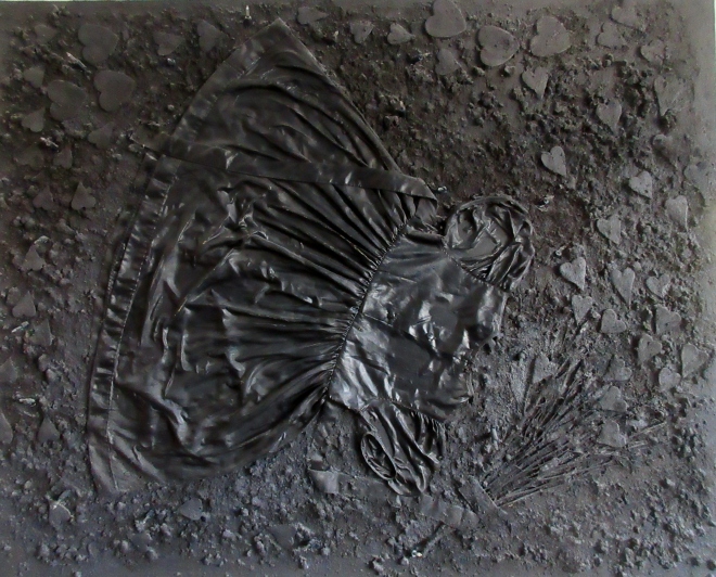
In my living room I have a very large all black painting, I made it years ago after a painting course, at the time I was influenced by Anslem Kiefer and his use of the colour black, and mixed media in his work. A friend who saw it, said one day’ that’s a depressing picture, very dark and moody’ Her deep response was towards it’s colour, black. For me, though I love the colour black, never saw the painting as depressing. And I know in the making of my work, I mixed my blacks from the primary colours, red, yellow and blue,taking a long time to get the black shade I wanted. I wasn’t offended by her remarks, as I knew colours, especially black, have different meanings and evoke strong emotions for many people.
So what does the colour black mean for me?
I wear black. In particular a black cardigan, I have always worn it, and even bought two for practical reasons. I love it, I feel safe in it, it has long sides that I can wrap around me to keep warm. It goes with my other clothes, and hides my shape too. Now I am older, black is such a comfort for me. I like the night when the sky is black, I can hid. But when I was a child I was scared of the night, and my mum would have to leave the landing light on when I went to bed.
I love the way storms bring in big black clouds with rain. Black clouds are exciting and dramatic for me. My daughter designs and makes clothes that are all black. I have lived with ‘the black dog’ for years, I have bouts of depression. I love to draw with a black Sharpie felt pens. The blackness and permanence of the ink give opportunities for expressive lines, to turn the white paper into black that a pencil cannot do. I love India ink and Reed pens. India ink is a strong medium that stands against colour, and gives me the chance to retain energy and spontaneity in my lines. The beauty of a Reed pen is that it offers a variety of marks, and black ink splutters and judders off the nib, making drawing unpredictable.
At home we have a black fridge and freezer. When my husband and I first saw this item in the shop it was instant love. The tall black, shiny monolith stood there like a goddess, so we bought it.
What does the colour black means to other artists?
I was reading about Franz Kline, he was influenced by Oriental art and collected many prints. His work is often linked to this influence, people saying it’s like calligraphy, but Kline always said his work is not about writing, it’s about painting black on white, and white on black, over painting black building up the layers, which took time, not like rapid movements as in Oriental drawing. He often work in a spontaneous way and executed his paintings on the pages of telephone books. During the 1950’s Jackson Pollock and Willem de Kooning were reducing their colours to black and white too.
Ad Reinhardt’s painting ‘Abstract Painting No.34, 1964, is a square shaped work with shapes that are difficult to see on the surface. His ‘black paintings’ were geometric abstractions that were reduced to shades of black. He devoted himself to working this way till his death. His works were minimal and became a forerunner to Minimal Art and Concept Art. I found it interesting that he painted manually with a brush, in such a way that no brush strokes could be seen.
Aldo Tambellini said of black; “Black is space, black is sound, black is color, black is darkness, black is anger, black is void.” Tambellini began his career as a sculptor, but I was impressed with his work at The Tate Modern which was all in black. On display are his glass slides and film, on which he applied black paint then burnt, scratched and pireced to make abstract images that were than projected onto a wall. His fascination with black was a consistent trait, as were his interest in cosmic energy. He saw black as the beginning of everything. He linked his use of black to the Black Power Movement of which he supported. I was interested in Tambellini’s used of the circle and spiral. In 1969 he used a black and white television and had it altered so the regular broadcast was transformed into a constant moving spiral. He saw this as the future, like nature in a spiral or circular form.
I am not able to try something like Tambellini’s spiral, but I did draw one on clear plastic with ink and a Reed pen, then photographed it on coloured gels reflected on a light box. Layering the coloured gels gave me black areas, placing the spiral or circle on top made those areas darker. But the spiral or circle was balanced with the lighter colours. However this is still, and as yet I’ve not explored movement with my piece.
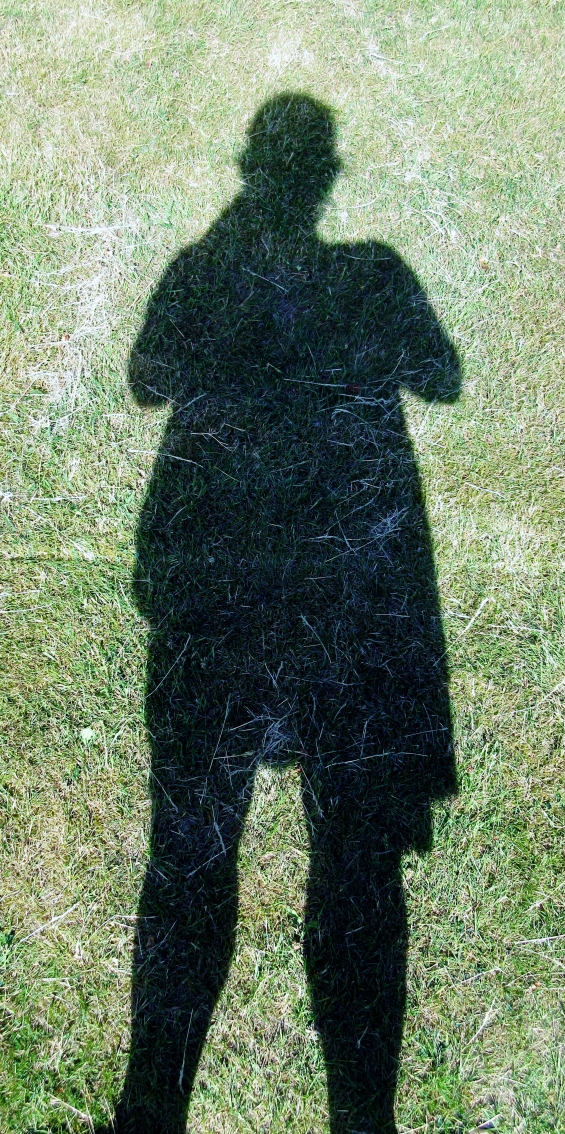
Kara Walker uses shadow cut outs to explore themes of sex and racial exploitation. She shone a penetrating light on prejudice and misogyny when many in the mainstream art world preferred to keep such issues in the dark. I too explored shadows in the early part of this drawing course. Carl Jung saw the ‘shadow’ as the side of your personality that contains all the parts of yourself that you don’t want to admit having. It’s an unconscious side. It’s only through self awareness that we recognise our shadow. I photographed my shadow, and some around my home, as I felt that I was getting to know myself and my surroundings as a new artist setting out on a new adventure into studying for my degree. I have to say I find shadows scary.
I recently watched the film, The Woman in Black (I have read the book too), as a horror film it had lots of shadowy figures and dark spooky corners, with lots of black, which made me jump, so the filming techniques were spot on. A good horror film relies on ‘things’ jumping out of the black to raise the hairs on your skin.
Fear is probably a good thing, it teaches us to be wary of the bad things in life. Black as a warning colour does this. Poison bottles use to be black. Some toilet cleaners are in black containers. Black is often put with yellow as warning triangles or tapes. Many of our road signs have a black exclamation mark or black cross as an additional warning.
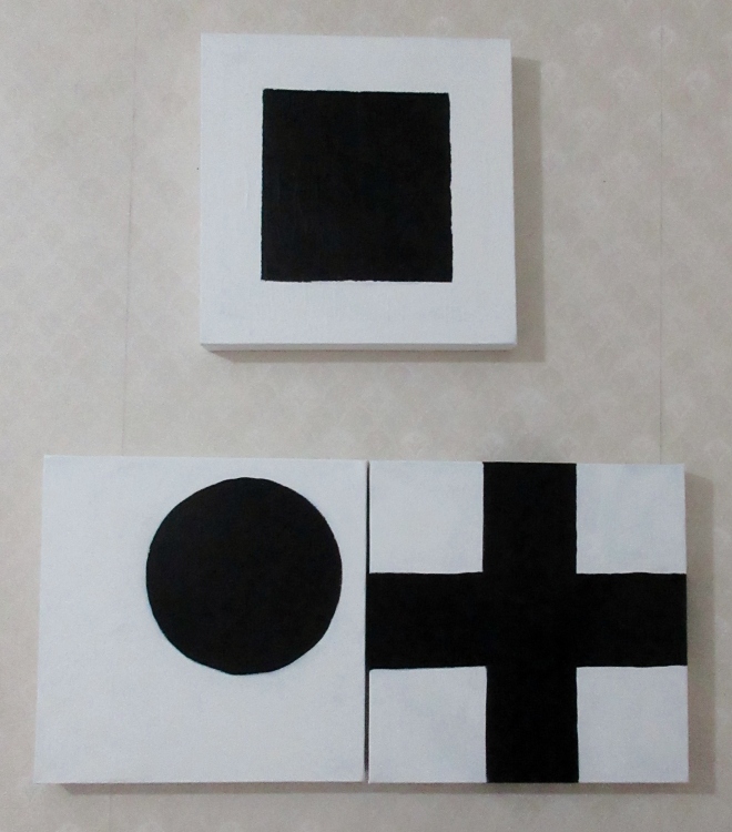
During my studies for the colour black, I became interested in the work of Kazimir Malevich and his black square, circle and cross. Malevich painted Black Circle in 1924, it’s an oil on canvas. Malevich called his new abstract approach to painting Suprematism. Suprematism is all about the supremacy of colour and shape in painting. He abandoned figurative or representational painting for pure abstraction. In his manifesto, Malevich described the paintings as “desperate struggle to free art from the ballast of the objective world” by focusing only on pure form. He sought to paint works that could be understood by all, but at the same time would have an emotional impact comparable to religious works. Earlier in 1913 Malevich painted the Black Square, in fact he painted four versions. He saw the Black Square as a new beginning, a start at zero. The Black Square was exhibited when the world was in chaos. He didn’t want the square to represent a real thing, but to be a symbol of a dawning of a new age. Perhaps we need a Black Square now, as our world in 2019 is in chaos and we need new hope of a better future.
From https://www.tate.org.uk/art/artists/kazimir-malevich-1561/five-ways-look-malevichs-black-square
So, what else have I learnt about the colour black?
I know it’s linked to advertising, fashion and war. Black is seen as a powerful element to sell clothes and advertise products. It’s sexy and mysterious. For years we have had the ‘little black dress’ by Coco Chanel. Black dyes developed during the Industrial Revolution gave ordinary people access to cheap clothing. Queen Victoria wore black as a sign of mourning after the death of Prince Albert, and this became common in Victorian England. It’s usually a sign of respect to wear black at a funeral.
In politics the word ‘black’ has been associate to express power or anarchy. The Black Army, was a group of anarchists in the Russian Civil War. Italy had the Blackshirts between World War one and two, it was an expressionism of Fascism. Black was also adopted by Adolf Hitler and used in the uniforms of the Nazis, and on badges and flags. Sadly a black triangle was imposed by Hitler on those less fortunate. In Islam, the Black Standard is flown by Muhammad as a symbol of Islamic tradition. Black is a traditional colour of the cavalry and armoured troops. German tank crews wore black uniforms. In Finland black is commonly worn in uniforms for most of it’s military people. Many other countries wear a black beret as a sign of military stance, such as Canada, Czech, Croatian, Portuguese, Spanish and Serbian armies.
Black is seen as a negative colour for war, but also a positive colour for groups such as ‘black power’ and civil rights movements. Black is also seen as a symbol of authority, power and solemnity as judges and magistrates wear black robes. Black is a common colour for cars for formal occasions, deaths, weddings and government officials. A black gown with a mortarboard is worn by those students who have passed their degrees.
Inks invented by the Chinese have given us the opportunities for writing, drawing and printing. Even writing this document is with black. The written word is always in black. Some animals that are considered dangerous have black in their name, such as Black Bear, Black Panther, Black Mamba snake, and Black Widow Spider. In the bird world we have the Black Bird, Black Crows, Rooks, Raven and Jackdaws, all black in colour.
Finally, music and pop stars. Many wear black and use black in the titles of their albums. The most famous being, Johnny Cash was known as ‘The Man in Black’, he always wore a long black knee length coat. He even wrote a song called ‘Man in Black’. He wore black in support of the poor, hungry and of the prisoner. French singer Edith Piaf always wore a black dress whilst singing on stage. Bands with black in their name range from Black Sabbath, Black Eyed Peas, The Black Keys, Black Flag, the Black Crowes, Black lips, Big Black are to name a few.
What about my art and black?
For this project I have painted with Chinese ink, which I ground myself, and a using splayed out brush I made many mandala or circle images. Working like this gave me the chance to work at a slower rate, as grinding the ink is supposed to be a sort of meditation, a time to think and reflect on the task. Using my Part three drawings of a local landscape I created a small series of very loose black views of Jersey Farm Woodland Park. If, I am honest I have conflicts between drawing all in black and adding colour washes. This time I didn’t add colour, I wanted the images to be just black. I did use the white of the paper to show the light areas though.
My additional work on clear plastic sheets I drew with Indian Ink and a Reed pen, once they were dry I placed them on a light box, whilst on this box, you could see all the small mark making and cracks created by the dried ink. I felt to take this further, I did add coloured lighting gels, my reason for this was to show that black is created by light, and these lighting gels did the job.
Overlaying them gave a different quality to the work, making everything darker and blacker. I wanted to film this process, but it didn’t work out and I need to think of a way to record any ‘movement’ of this dark light or ‘movement’ of the drawn clear images.
I have made two ‘black’ sketch books, one with my 50 drawings of black, presented in a loose style book, and a working sketchbook with my images and writings. Most of the writing is word processed and written in black. I am not sure if I have a final image or drawings for this project, but I did read a lot and found this more interesting than making the art itself. Researching artists was the most informative and I will be looking forward future artist research.
Before I started this project, I did discuss with my tutor, my feelings towards working in a realistic way compared with working abstract. Through out this project I have tried to explore both, as I did draw some black landscapes. But after ‘playing’ with the coloured gels and drawing on clear plastic, I much preferred working in and abstract way. I suppose this feeling has been confirmed by my studies of some abstract artists.
Finally Odilon Redon was a sensitive artist who, for many years, worked only in black. Redon referred to these as his ‘blacks’, using black charcoal and lithography, Redon worked in this way to explore his imagination and anxiety from his childhood. He described himself as morose and melancholy. In his blacks he had a morbid occupation with death. However, Redon’s life changed and he started to embrace colour.’ Colours contain joy which relaxes me; besides they sway me towards something different and new’ Redon 1894. (page 54)
Just to add, like Redon, I too have worked in one way for many years. Drawing and painting brightly coloured landscape images. I now feel that I am entering a new way of working, and seeing my new art process as a way forward.
Reading
Clinch. Moira. The Watercolour Painter’s Pocket Palette, Search Press, 1998.
Fincher. Susanne.F. Creating Mandalas, For Insight, Healing and Self-Expression,Shambala, Boston & London, 1991.
Hess. Barabara. Abstract Expressionism. Taschen, Cologne, 2011.
Hobbs. James. Pen and Ink, Contemporary Artists, Timeless Techniques,London, 2016.
Kaupelis.Robert. Experimental Drawing, New York. 1980.
Roalf. Peggy. Looking at Paintings. Self Portraits,London.1993.
Wilson. Duran. Sandra & McElroy. Olivia. Darlene. Surface Treatment Workshop. Explore 45 Mixed-Media Techniques. USA. 2011.
Wilson, Michael. Nature and Imagination, The Work of Odilon Redon, Phaidon, Oxford, 1978.
https://www.artinamericamagazine.com/reviews/aldo-tambellini/
https://www.theguardian.com/artanddesign/2016/sep/26/anish-kapoor-vantablack-art-architecture-exclusive-rights-to-the-blackest-black
https://www.ranker.com/list/the-best-bands-with-black-in-the-name/ranker-music
https://www.tate.org.uk/art/artists/kazimir-malevich-1561/five-ways-look-malevichs-black-square
https://en.wikipedia.org/wiki/Black
https://en.wikipedia.org/wiki/Johnny_Cash
https://www.theguardian.com/lifeandstyle/2015/oct/09/coming-out-of-the-dark-why-black-is-such-a-positive-colour
https://en.wikipedia.org/wiki/Shadow_(psychology)
Exhibitions
Tate Britain. 27th Mar -11 Aug 2019. The EY Exhibition, Van Gogh and Britain.
Assessment criteria points
Demonstration of technical and visual skills-materials, techniques, observational skills, visual awareness, design and compositional skills.
I feel that I am able to use my known technical and visual skills to create this project. I am a watercolour artist, so many of my painting techniques have transferred to my drawings on paper. I am able to chose my materials for the correct use, to buy any additional equipment to help in my process i.e. a light box which runs off my computer. I continue to develop design and experiment with composition in my work. I have enjoyed ‘playing’ around with basic shapes, such as squares and circles. I have, also, experimented with line and texture in my mandalas.
I take inspiration for exhibitions and reading about artists, finding new ones on a daily basis, artist research is very important to me.
Quality of outcome- content, application of knowledge, presentation of work in a coherent manner, discernment, conceptualisation of thoughts, communication of ideas.
I have presented most of my work in two sketch books for this project. I have created a small series of mandalas on paper and a small six mandala piece for my tutor to see. My thoughts and ideas are presented in my blogs, which are illustrated with my work. I have made a few short films on Instagram and Vimeo of my put door installation work. These are listed in the blogs.
The making of the installation was a simple effect but a very creative outlet for me. The use of a light box, too was a simple idea, but very effective and beautiful.
My weakness is to add too much information in my sketch books, but I think these books are for ideas, ones you may use, other ideas which will be unused.
Demonstration of creativity- imagination, experimentation, development of a personal voice.
I am able to really explore my creativity, writing about them is the hardest thing to do. I love to experiment, I think it’s very important to try ideas, even if they fail. You can learn a lot from failing ! I have tried many ideas, and really need to do more. This project I chose about black is a vast subject. I decided that it will not be finished, but will just exist alone, as an unfinished piece. However I was keen to make some ‘final’ pieces, which are in the shape of works on paper and plastic. I did chose to work in the abstract, using line, shape and form, in my ideas of light, dark and I included a colour element.
Context reflection- research, critical thinking (learning logs and, at second and third level, critical reviews and essays.
I have written many blogs for this final project, these included artist research and reading, my thoughts and reflections about my art work. I do keep these blogs up to date. I have printed off a the relevant ones to send to my tutor. I have included the research and the ideas I explored in my previous exercises, as support for this part five project.
